Step 01
Onboarding
Connect Gmail, Outlook, or IMAP from a single focused card.
A complete design system, eight product screens, and a marketing landing page for a tool that auto-detects applications from email so job seekers never lose track of a role again.
Nextstep is a job application tracking platform built to eliminate manual data entry. It connects to Gmail, Outlook, or IMAP, parses incoming recruitment emails, and creates application records with status tracking — all without the user opening a spreadsheet.
Job seekers track applications in scattered spreadsheets and lose follow-up opportunities.
Auto-detect applications from email and surface them in a clean, confidence-building UI.
A scalable design system with Figma Variables that the product team can extend in seconds.
Most job seekers rely on manual spreadsheets, which create bottlenecks and miss follow-up windows. The product needed an interface that:
I built the system before I built the screens. A tight palette, a typographic scale, and a token layer meant every screen I shipped after that was a recombination — not a one-off.
The system is inspired by Notion's clean aesthetic, paired with a warm coral accent. Neutral whites, soft grays, and a dark ink color carry the weight; coral does the signaling.
I built a Variables collection with semantically named tokens so the team can change the brand color globally with a single update instead of editing more than a hundred instances.
25 color tokens · 9 spacing tokens · 6 radius tokens. Naming is semantic, not literal — so swapping coral for any future brand color is a one-line change.
I designed eight screens — four desktop, four mobile — each owning one moment in the user journey.
Every view has a single focal point. The dashboard centers on the table; onboarding centers on connecting an inbox. This removes decision fatigue and keeps users moving forward.
Coral is reserved for CTAs, accent headlines, status indicators, and focus states. Restraint is what makes it readable as a brand.
Inter with generous tracking and no all-caps headlines keeps the product premium without feeling cold or corporate.
The Email Sync screen shows exactly what the system detected — logo, role, status, email preview. Users approve what gets tracked, which builds confidence in automation.
The marketing site leads with the pain point, walks through three plain-English steps, and lands on a coral-saturated CTA. Every section was rebuilt at least once after a structured critique pass.
The first landing page draft was functional but noisy. A second pass tightened the hierarchy, the copy, and the color story.
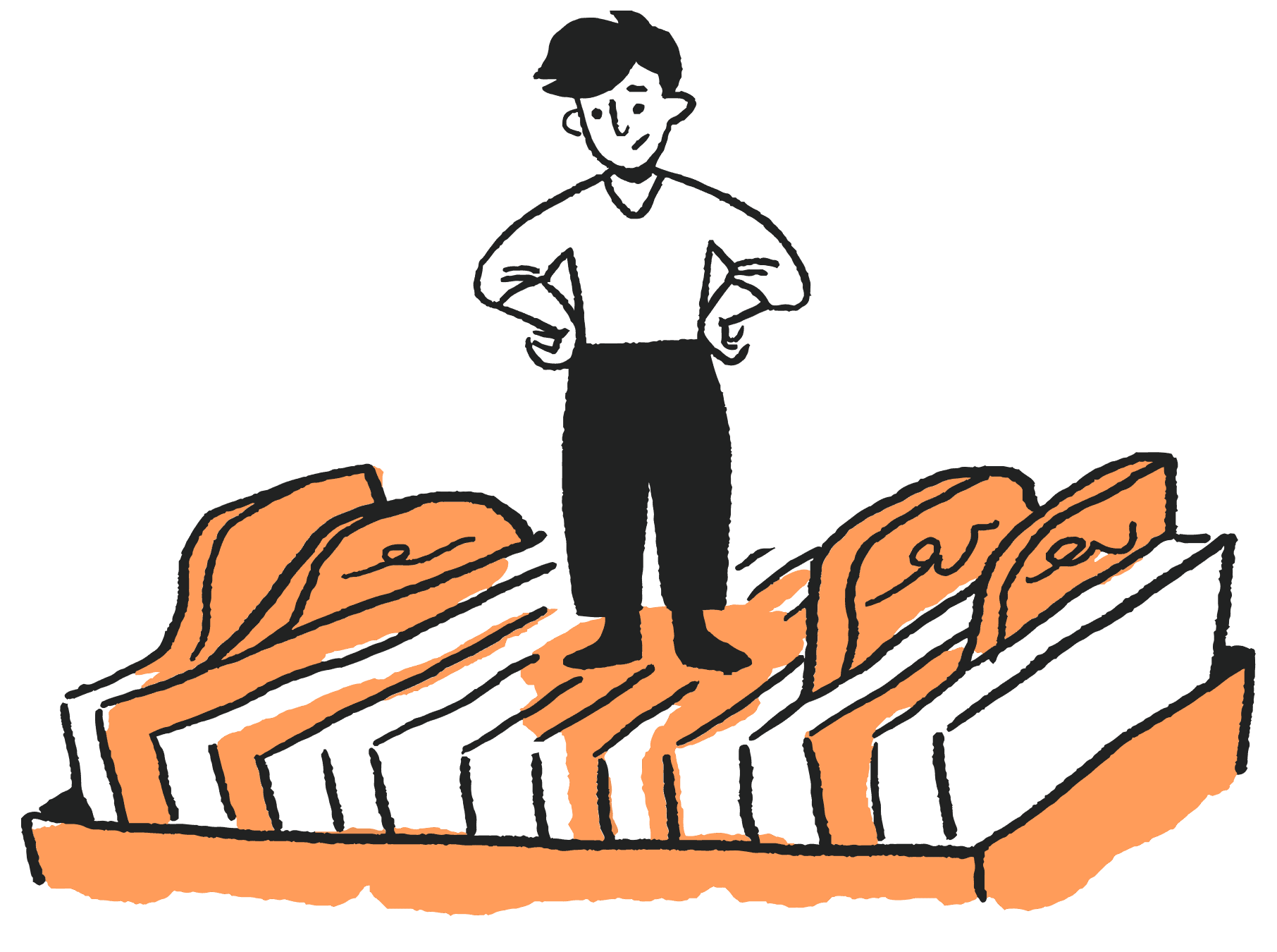
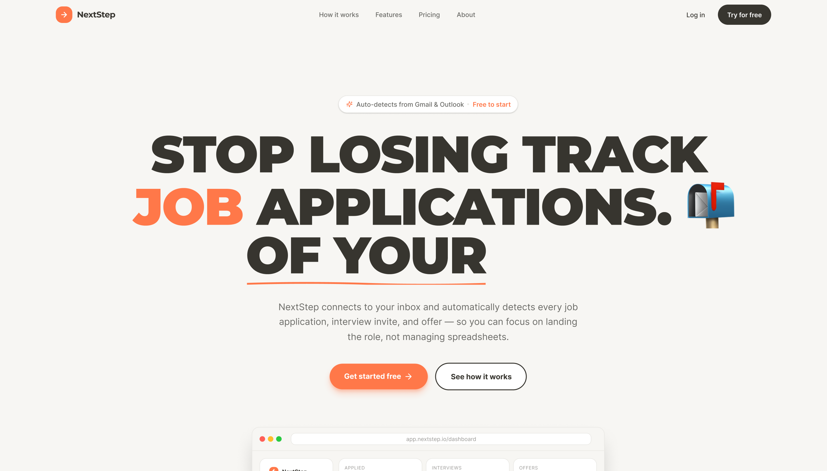 Before
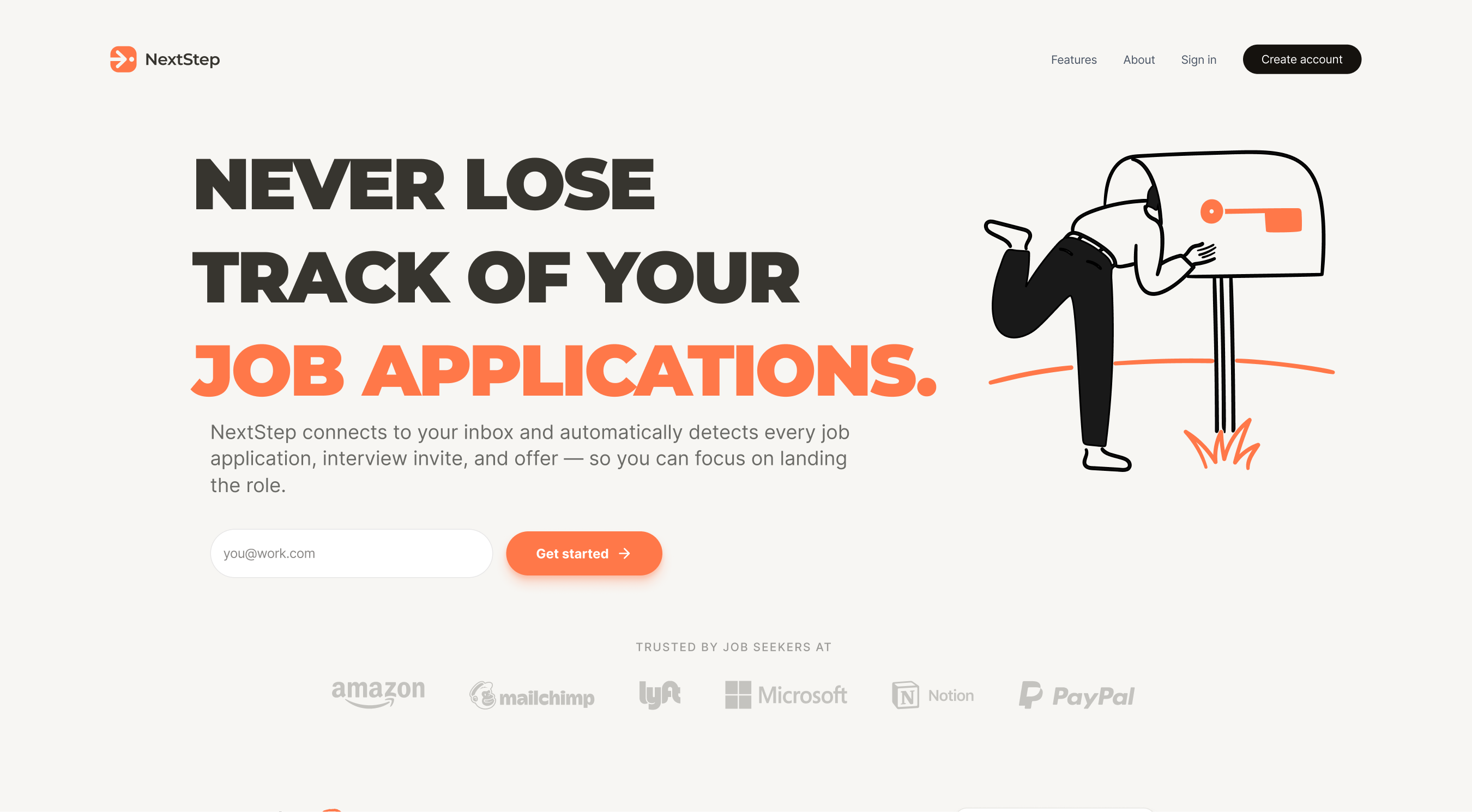 After
AfterI treat design and engineering as one continuous workflow. Figma owns the source of truth for the visual system; Claude Code and GitHub are how I prototype, version, and hand off without losing context.
Source of truth for every screen, component, and variable. I lean on Figma's Variables and Auto Layout to keep the system flexible and the file fast.
I use Claude Code to translate Figma sections into working HTML and CSS, scaffold prototypes, and pressure-test interaction logic before it goes back into the design file.
Every code-side artifact lives in GitHub — landing-page prototypes, token exports, and handoff docs. Commits make it trivial to roll back a bad idea or branch off a good one.
The biggest win wasn't a single screen — it was building infrastructure that makes the next ten screens cheap. The team can now swap brand colors globally in seconds, A/B test layouts without rebuilds, and hand off to engineers with confidence.
Semantic naming up front makes every brand evolution cheaper and faster.
A tight palette and small type scale remove small decisions so meaningful ones get more attention.
The biggest landing page improvement came from rewriting one headline.
Showing users what the system detected and letting them approve it turns automation from scary to useful.

The project reinforces a core principle I keep coming back to: constraints enable creativity. A tight palette, a clear grid, and a semantic token layer don't slow design down — they let the work move faster, stay coherent, and survive the next round of changes intact.